Portfolio of previous work
Click on image to enlarge, or click on the grey boxes to scroll through more detail.
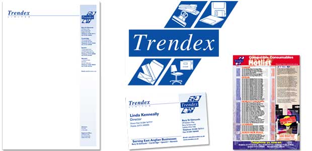
Trendex Office Supplies
The corporate stationery needed refreshing, using the existing logo. After producing the letterheads, comps and assorted business cards, we designed a series of mailers and promotional material.
- We also enjoyed creating the annual Catalogue covers - for over ten years, each one has been totally different in style!
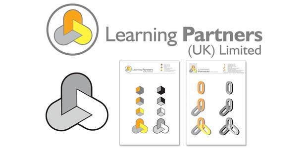
Learning Partners
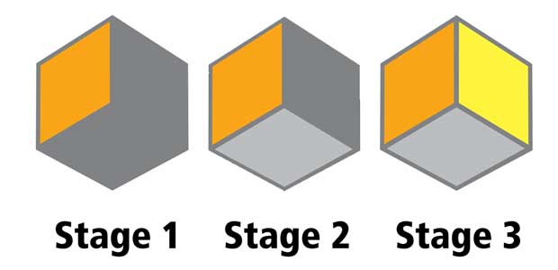
Learning Partners approached us to design a new logo that demonstrated their three-part qualification system.
As a candidate progressed, the course materials given would adopt the logo appropriate to the qualifications gained, but always keeping the overall Learning Partners corporate identity in mind.
Stow Fish Bar
Our local chipshop asked for a cartoony new logo to go with their recent refurbishment. This was the very first job where we actually got paid in chip suppers...
And very delicious they were, too!
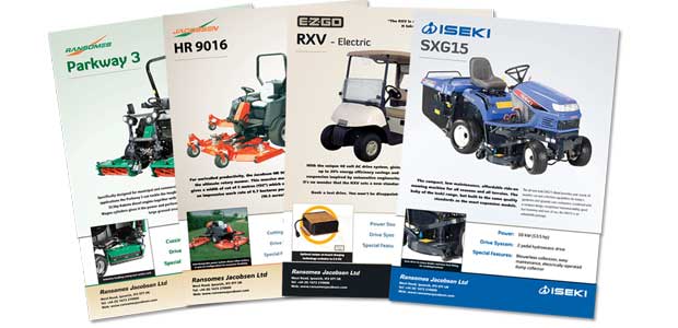
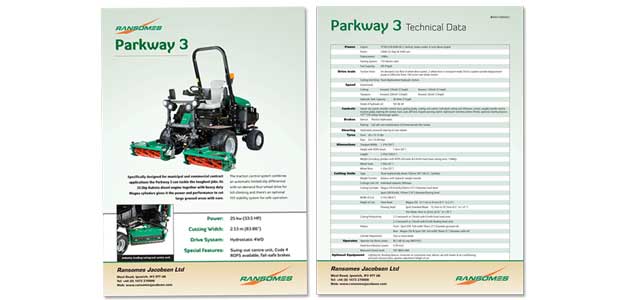
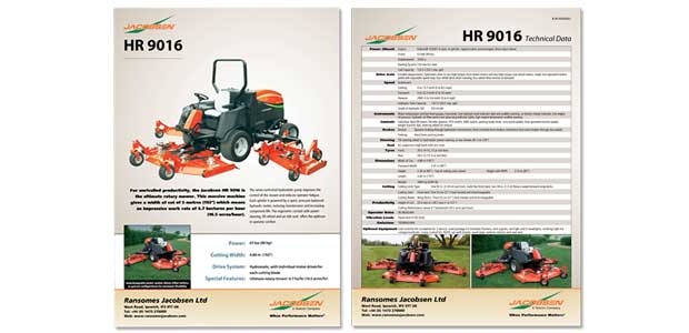
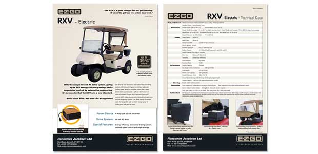
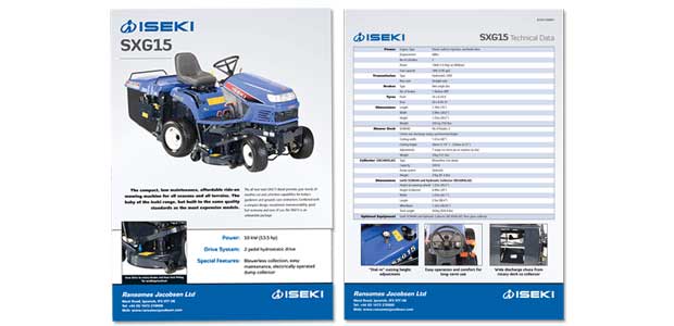
Ransomes Jacobsen
Brands realignment & overhaul.
Complete refresh of the 4 main brands in the Ransomes Jacobsen portfolio. We organised (and indeed took much of) the photography, got the technical specifications and laid the pages out in a style in keeping with the brand standards.

